

While not always rational (or even helpful) our intuition fundamentally shapes how we think. In this post, summer intern Julie illustrates how she uses statistics to keep her analyses grounded, and how that translates to business value.
Why Do We Trust Our Guts?
Intuition (aka “gut feeling”) empowers us to understand things about the world instinctively, even in the face of constant uncertainty. It can be incredibly useful for making snap decisions, channeling creativity, and more. However, when you work with data, it’s important to acknowledge that intuition is not a rational way of thinking, and it can sometimes get in the way of good analytics.
It’s likely we evolved intuition because, in the past, the ability to use mental shortcuts to make quick decisions was necessary for survival. Humans who sensed a predator nearby were more likely to reproduce compared to their less-alert peers. And even if you guessed wrong and there was no tiger after all, that didn’t keep you from passing on your neuroses to your offspring. Our brains became experts in recognizing patterns, even sometimes when there aren’t any.
The world we live in today is much more complex than the hunter-gatherer world of our human ancestors and requires more logic. And yet our brains are still biased against skepticism. In intricate situations, our intuition can lead to false assumptions, biases, and logical fallacies. I chose to major in statistics because it felt like a bridge offering safe passage across the pitfalls of intuition: a logical way of understanding and reasoning with the world.
Out of the Classroom and Into the Fire
This summer, having completed my freshman year of college, I followed my gut to an internship at Rotational. I was encouraged to choose a project that interested me and was presented with several suggestions; and again I followed my intuition, this time to a predictive modeling project designed to flag a distributor-client’s problematic orders. Ultimately, my intuition was right — the project validated what I’m learning at school and my beliefs about statistical reasoning. It also raised more questions for me about what statistical results and predictive models really tell us about the world, and it’s given me a lot to think about as I head back to school.
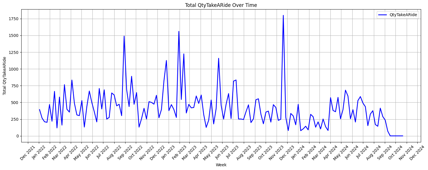
When I first began working on my project, I was given access to the distributor’s extensive database, which included dozens of related tables containing order history, customer information, item details, and more. The ask was to use this database to create a predictive model to flag orders that would be rejected. Distribution insiders refer to this as “taking a ride,” and it’s actually quite an expensive problem. The issue occurs when a customer places an order and then refuses part or all of the order upon delivery. These rejected items have to be taken back to their warehouse and stored. This problem adds up in lost profits for the distribution company because it requires time, labor, and money to transport items to and from a customer unnecessarily.
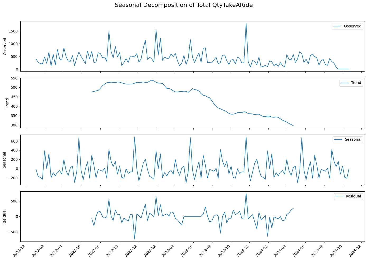
After doing an initial data cleaning and discovery pass, I tried looking for an attribute in the database to differentiate problematic orders from the unproblematic ones. I worked with the data in a Jupyter notebook and used several Python libraries, including Pandas, NumPy, Seaborn, and Matplotlib. After considering several possible causes for problematic orders, including the time of year, time between orders, item type, and more, I found no significant correlation that could help even explain, let alone solve, this problem. As I considered the root of the issue more deeply, I felt like the database that I had to work with wasn’t enough. Whatever factors could explain why customers were rejecting orders, such as their inconsistent stock, poor communication, or planning, were not encoded in the data. There seemed to be no significant pattern in the data that could be used for prediction, and I was unsure that I could solve this problem without more external data.
Revisiting the Assumptions
After taking some time to research different predictive models and discussing the problem with my coworkers, I decided to approach the issue from a different angle. Instead of focusing on specific orders, I turned my attention to specific customers. I reasoned that whatever was causing customers to send back items to take a ride was occurring at a customer level, so if I could identify the most problematic customers, it could aid in predicting what orders would take a ride in the future.
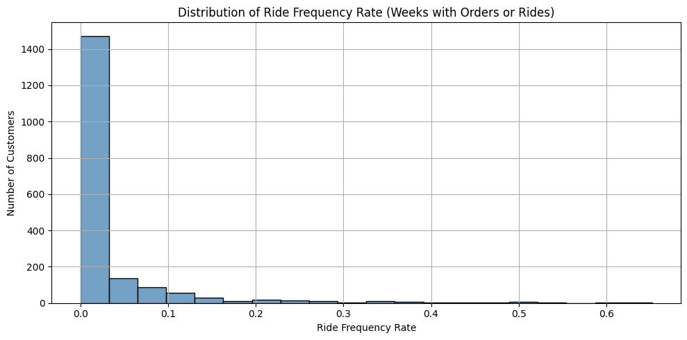
I started by calculating each of the 1,877 customers’ ride frequency rates. This involved dividing the customer’s total number of weeks with rejected items by their total number of weeks with orders, and it showed how frequently each customer was rejecting their deliveries. Based on the distribution of the customer’s ride frequency rates, I created three different categories to describe the customer’s rejection behaviors:
Rare rejectors: These were the customers that had a ride frequency rate less than 0.1, meaning that out of all the weeks that they had orders, they rejected items in less than 10% of those weeks. Most (90.6%) of the customers fell into this category.
Sporadic rejectors: The customers with a ride frequency rate between 0.1 and 0.5. Out of all the times they placed orders, these customers rejected items between 10 and 50% of the time. 8.7% of the customers fell into the sporadic rejector category.
Frequent rejectors: Customers who had a ride frequency rate above 0.5, meaning they rejected items in more than half of their orders. Only 0.6% of the customers fell into this category.
The analytical pivot paid off right away. I was surprised to see how skewed the distribution of customers was by their ride frequency rates, but it also made me more hopeful that it would lead to important findings. Next, I calculated how much each customer category contributed to the total number of items that took a ride. It was shocking to see the results, as the frequent rejectors (who only made up 0.6% of all customers), were responsible for 21.2% of the items that were taking a ride, which was more than the rare rejectors (who made up 90.6% of all customers), as they were responsible for 20.2% of the items taking a ride.
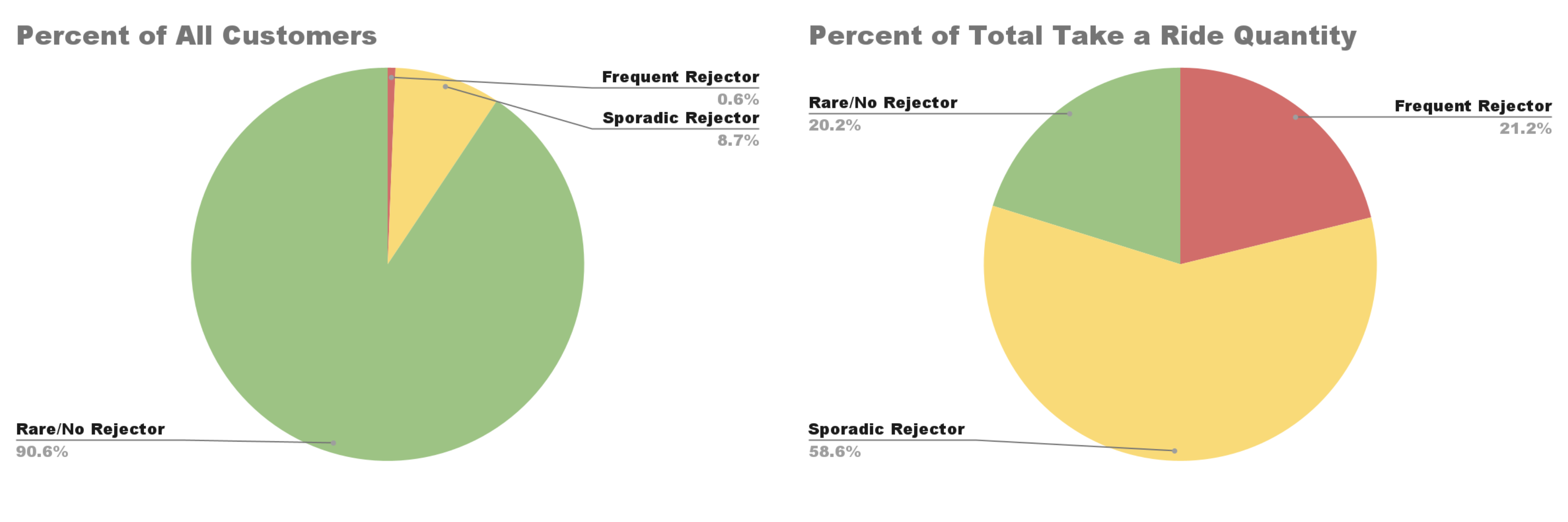
These results felt promising because they hinted at a solution. Different customers contributing to the overall problem at varying levels hinted at the fact that whatever factor was causing orders to be rejected was happening at a customer level. Perhaps taking a ride wasn’t systemic but rather concentrated in a subset of customers, in which case the distributor could focus on minimizing the number of items getting rejected by these customers and solve the majority of their problems. If the company focused on the frequent and sporadic rejectors, who only make up 9.3% of the population, they could potentially eliminate 79.8% of the items taking a ride.
Zeroing in on a Solution
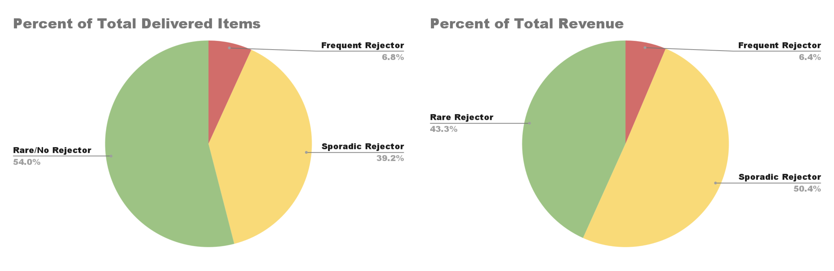
This seems like an effective solution, but I wanted to consider other potential explanations for these results. For example, the customers in the frequent and sporadic rejector category could be the biggest customers, meaning they are responsible for the most amount of orders, and this would also explain why they account for most of the rejected items. To test if this was the case, I considered how the different customer rejector categories accounted for the overall quantity of items delivered and the total revenue.
The results (shown below) hinted that there were, in fact, more large customers that were frequent and sporadic rejectors, because both customer categories accounted for a larger proportion of the total delivered items and revenue than the proportion they accounted for in the customer population. At the same time, the proportion that both categories accounted for in items delivered and revenue was much smaller than the proportion of items taken for a ride that they accounted for, which indicated that there was something other than customers’ sizes that was making different customers reject items at different levels.
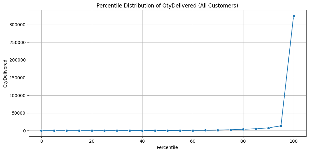
Next, I wanted to get a closer insight into how much customers’ sizes varied across the customer population and how customers were distributed by their size. I plotted the customer’s percentile distribution by their total quantity of delivered items (shown below), and was surprised to see how highly skewed the results were. The percentiles revealed how a small number of the largest customers account for a disproportionately large share of the total delivered items. Most industries have strict definitions for what classifies a customer as small vs. large, but for this project, I decided to classify a customer as small if their total quantity delivered fell below the 90th percentile and classify a customer as large if their total quantity delivered fell at or above the 90th percentile. I found that despite only making up 10% of the customer base, large customers accounted for 64% of total delivered items, 75% of total revenue, and 91% of items that took a ride. These results reveal how most of the distribution company’s value and rejection risk comes from a small portion of customers. Although the total volume of delivered items is skewed heavily by customers, this alone doesn’t explain why certain customers are responsible for a disproportionate number of items taking a ride, meaning that there’s more than customer size at play here.
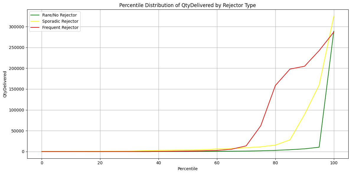
To see how the different customer rejection categories varied by customer size, I plotted and compared the percentile distribution of total quantity delivered by each rejector type. I found that frequent rejectors are not the largest customers overall, and that at the median, sporadic rejectors are larger than frequent rejectors. This suggests that the frequent rejection customers are not large customers overall, but because they are such a small group, a few large outliers are skewing their average values. The majority of frequent rejectors are mid-size customers. I also found that across most of the percentiles, the sporadic rejector group has the highest total delivered items, meaning that they are generally the largest-sized customers. The distribution of the rare customers suggests that they are the smallest customers overall and that the vast majority of them are small-sized customers. Combined, these results disprove the idea that customer size alone explains their rejection behaviors.
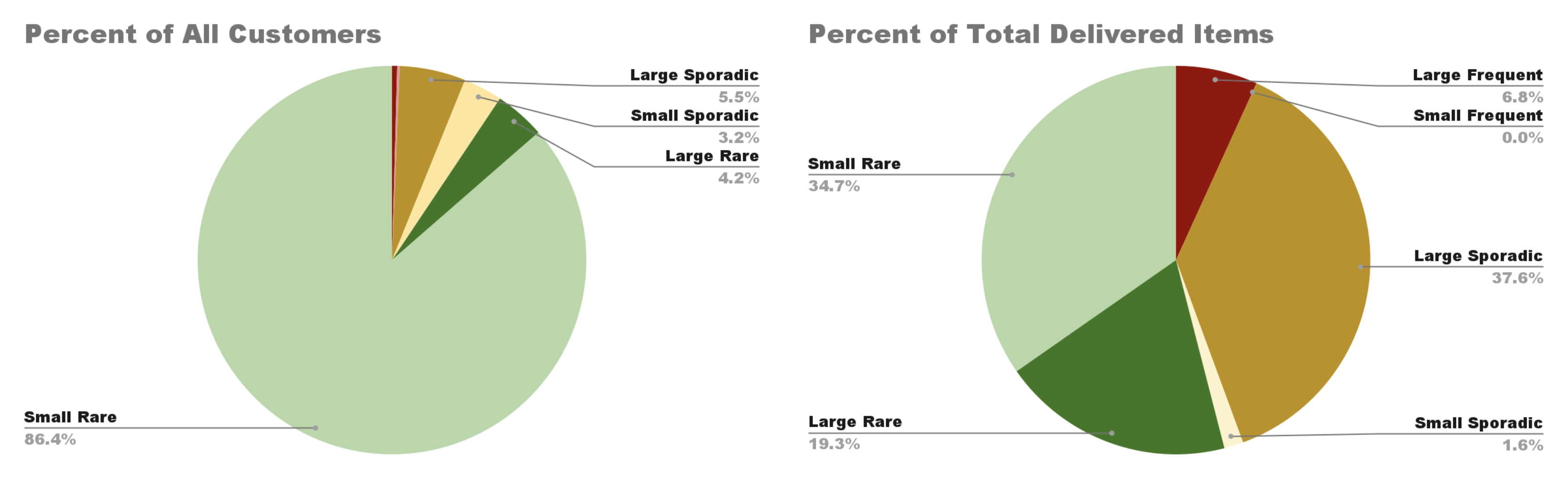
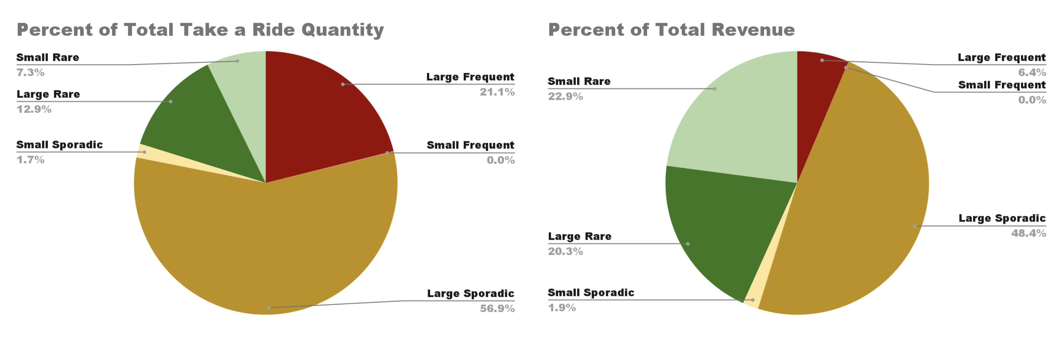
Next, I created a composite category by combining customers’ size and rejection type to create six distinct segments: small frequent rejectors, large frequent rejectors, small sporadic rejectors, large sporadic rejectors, small rare rejectors, and large rare rejectors. This segmentation allowed me to take a closer look at which types of customers bring the most value and pose the highest risk for the distributor. When I analyzed how these segments contributed to the total volume, revenue, and rejected items, the results were surprising.
I found that large sporadic and large frequent rejectors made up only 5.9% of the customer base, and yet they accounted for 44.4% of total delivered items, 54.8% of the revenue, and a staggering 78% of all items taking a ride. This shows that the issue isn’t widespread across the customer population; rather, it’s highly concentrated in a small, high-impact group. These customers are valuable due to their volume and revenue, but they also carry the greatest operational cost in terms of rejected items. In contrast, the remaining 94.1% of customers, mostly smaller in size, are responsible for just 22% of the rejected items. This strong disparity supports the value of a dual segmentation strategy by size and rejection behavior, because it captured patterns that neither factor revealed on its own.
What stood out to me the most from this analysis was how extreme the imbalance was between customer segments. It’s a clear example of the Pareto Principle, the idea that roughly 80% of effects come from 20% of the cases. In this case, the imbalance was even more extreme, as nearly 80% of the rejected items were caused by just 5.9% of the customers. This kind of distribution is counterintuitive, and there’s a psychological explanation for why. Linearity bias refers to humans’ tendency to assume that relationships between variables are linear when they may be curved or exponential. We do this because our intuition wants to simplify information and identify easily predictable patterns, and linear relationships are the easiest to understand and apply to situations. Intensity matching is related to the linearity bias, it’s the idea that humans intuitively expect small causes to lead to small effects and large causes to lead to large effects. Our intuition favors simple explanations that are balanced and symmetrical, so the fact that a tiny group of customers is responsible for most of the rejections initially seems suspicious.
Most real-world systems, especially in business and economics, follow power-law distributions where a small number of inputs have a huge impact. The reason this matters is that our intuition tends to miss these patterns. We assume all customers should be treated equally because we intuitively expect each one to contribute equally to outcomes. But the data shows that doing so would be ineffective in solving the problem of items taking a ride.
Working on this project reinforced something that I’ve come to believe: intuition is powerful, but often deeply flawed when applied to complex systems. Often in environments like business, economics, and engineering, effects are non-linear and data is messy, and our intuitive reasoning can lead us to incorrect conclusions. Statistical reasoning, on the other hand, helps us fight these cognitive biases. It shows us patterns we wouldn’t expect, and it forces us to ask questions we wouldn’t naturally consider. In this case, trusting the data over my gut led to an unexpected but actionable insight: the problem wasn’t everywhere, it was heavily concentrated. Solving it won’t require systemic change, but rather a targeted focus on a small but impactful group of customers.
The Limits of Statistics
When I first started working on this project, my goal was to build a predictive model that could flag problematic orders before they got shipped to the customer. I imagined that I would have a clean outcome, a model with high accuracy based on clear patterns in the data that would be ready to be used. In reality, the database that I was working with didn’t contain the kinds of variables that drive customers to reject items, such as communication issues, planning failures, or inventory problems on the customer’s side. These kinds of variables are not easy to capture in a database.
Over time, I came to realize that what I thought was a prediction problem was a pattern recognition problem. I wouldn’t be able to confidently predict individual outcomes, but I could uncover customer behavioral trends that showed a bigger picture. This shift, from modeling to analysis, taught me something deeper about what statistical results tell us about the world.
I realized that statistical results don’t explain what’s happening in the world, rather, they explain what’s happening in the world that we view from the data that we have. This means that every statistical insight we have is limited by what data is being measured, how it’s collected, and what assumptions we hold in the process of data collection. At the same time, this project showed me how powerful descriptive statistics can be. The idea that only 5.9% of customers are responsible for 78% of items that took a ride wasn’t something that I initially set out to discover. It only appeared after I stepped back from the problem to consider the limitations of the data I had and questioned my assumptions about the root cause of the problem and what predictive results would look like.
This project pushed me to reflect on how our assumptions about data can be misleading. In the end, although I didn’t build the predictive model that I initially intended, I was able to gather valuable business insights and fresh insights that excited the customer. I finished this project with a greater sense of the power and limitations of statistical results, and a deeper appreciation for skepticism and curiosity in the role of data science.
Photo by ThisisEngineering on Unsplash